What is one of the most difficult decisions a homeowner must make when adding or enhancing his or her home? Some homeowners struggle to find the right contractor or the right price, but one of the most common and unexpected decisions that homeowners must make is choosing the color or style of materials for their new projects. Luckily, RCP provides a vast selection of complimenting and contrasting colors in all of its hardscape and masonry products.
Sometimes, by considering the structures that already exist, a homeowner can use these surrounding materials as a color key to work from. For example, if a homeowner loves the paint color on their house, they might look for a complementing decorative rock or interlocking paver color. If another homeowner struggles to choose an interlocking paver color for their new patio, that person might look to a nearby retaining wall for inspiration.
One of the wonderful aspects of many RCP products lies in our decision to maintain consistency in our color line. So, many RCP retaining walls can be coupled with equivalent interlocking paver colors to enhance and streamline your new installation.
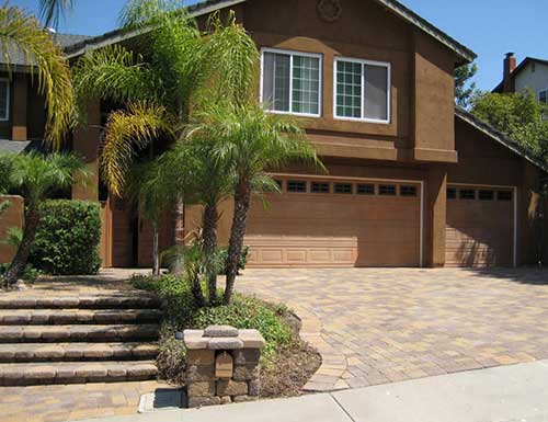
By choosing complementing materials for a new project, a homeowner can achieve a balanced beauty enhanced with gentle nuances of color. Having a more homogeneous coloring in this way creates a natural look that represents a garnish more than a centerpiece. One example of this complementing design might be using one of RCP’s brownstone retaining walls near a brownstone interlocking paver installation. Because the brownstone coloring is still blended, a homeowner gains some variation without making the wall or the patio draw attention to itself.
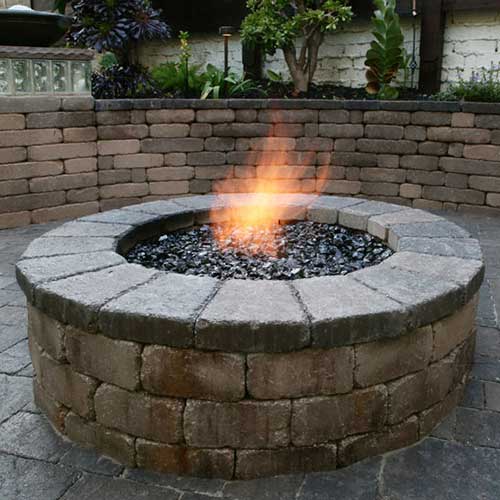
However, if a person wanted to achieve a more modern, exotic, or bold effect; he or she could look for opportunities to create highlights in the installation with more saturated colors or with a larger variety of colors. One example of this contrasting design might come from RCP’s Terra Cotta Brown Country Manor with a Charcoal Brown cap. The charcoal tone in the cap creates a nice visual edge, and because both colors are deeply saturated, they immediately stimulate the passer-by. Similar effects can be achieved by using a differently colored border on a interlocking paver installation or by blending two RCP colors in varying proportions. A homeowner may even decide to use a material of a contrasting color as a key piece sporadically throughout an installation to break up more uniform colors.
So, no matter what other difficult decisions you have to make regarding your new home project, let these two considerations act as the first steps in your design process; though they are not all encompassing, these two ways of looking at your new project can make your design process smoother.